Rubber stamp
This recipe will show you how to use Photoshop to apply a rubber stamp effect to text. You can also use some of the techniques in this recipe to create a grunge or distressed effect on text or graphics.
Table of contents
Select font and add text
First, open Photoshop and create an empty canvas (). Make a fairly large canvas, for example 800 × 600 px.
Then select the horizontal type tool and pick the font you want to use. The best fonts for this type of project are heavy fonts with thick and fairly even strokes. Good candidates are Arial Rounded MT Bold, Cooper Std, GoudyHvyFace BT, and Impact. In this example am going to use Cooper Std.
Pick the horizontal type toll and set the text colour to black and use a large font size (I use 144 px). I find that rubber stamps work best in all-caps. The text for the example rubber stamp is going to be “RUBBER STAMP“, split over two lines. I type that as two separate lines to get each word in a separate layer. This makes it simple to manipulate (e.g. scale) each line independent of the other.
In this particular example, I do not like the space between the “T” and “A”. To adjust this, I bring up the character panel (). Position cursor between the “T” and “A”, then go the character panel and set the kerning to -100, as shown below.
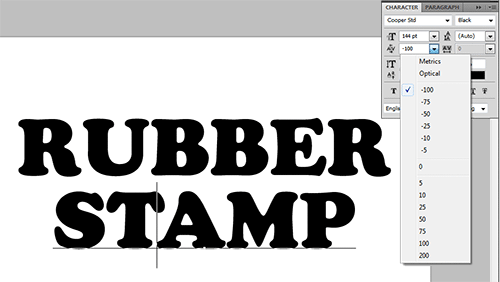
I also want both words centred. This is done by selecting both in the layers palette. Activating the Move tool brings up a line of alignment tools in the options bar (above the canvas). Clicking on the tool to centre both lines horizontally.
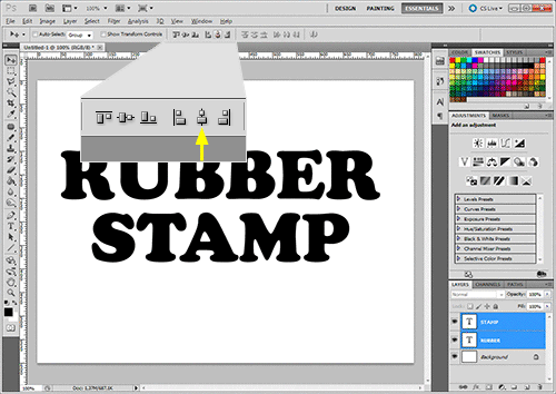
The enlarged insert shows the Photoshop alignment tools and the yellow arrow points the alignment tool that can be used centre layers horizontally.
Because the first line consists of six letters, and the second only of five, their width is different. I want to stretch the second line to make it equal width of the first. First, to help me do this right I place two guides that indicates the start and stop of the top line.
To use guides, you must have rulers. You can turn on the rulers by going to in the top menu bar and selecting in the drop-down menu to put a check mark next to it. Two rulers appear on the canvas: One positioned across the top and one running down the left side.
To place a guide, click with your cursor in the left vertical ruler. Hold down and drag to the image. As you drag, an indicator on the top horizontal ruler indicates the position of the guideline. Release the cursor. A turquoise line appears on the image. This is a vertical guide. Put one vertical guide before and after the text in the top line, as shown in the screen dump below.
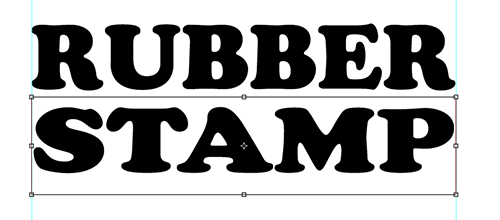
The, in the layers palette, select the STAMP layer and scale the text in word horizontally (). The result, after scaling to match the with of the word above, is shown on the screen dump above.
Add a rounded rectangle
I'd also like to put a rounded rectangle around the text. Select the Rounded Rectangle Tool. Then adjust the radius in the options bar and set the colour to black. I use a radius of 30 with this size document. Also make sure is selected in the options bar.
Use the mouse to draw a rectangle around the text. Make it a bit larger than your text so it surrounds it with some space on all the sides.
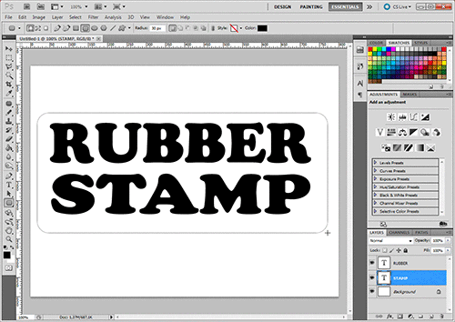
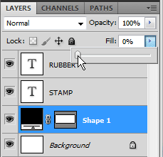
The default is that the rectangle becomes a solid shape. However, it is simple to turn this into an outline. In the layers palette, select your rectangle layer, and move the slider to 0 %.
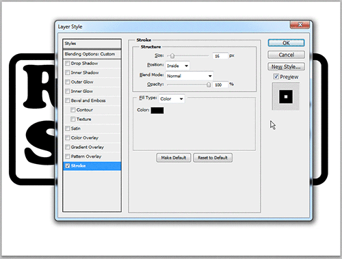
Right click on a blank area of the rectangle layer, and select . Check and click , and set the stroke as follows:
Size: 16
Position: Inside
Blend Mode: Normal
Opacity: 100%
Colour: Black
This results in a 16 px rounded rectangle surrounding the text.
Select the text object and the shape layer from the layers palette. Activate the move tool and click the buttons to align horizontal and vertical centres. This makes the rounded rectangle centred around the text.
Now, with both layers still selected, right click in the layers palette and choose . This means that both lines are a single object, but still editable. For the rest of the recipe, I want to treat the two lines of text and the rounded rectangle frame as a single object.
Create a pattern layer
Now, to create a distressed and grungy look, we are going to combine it with a pattern that simulates the imprint of a rubber stamp on rough paper.
In the layers palette, click the black and white circle to create a new fill layer. Choose the option.
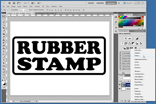
At this point you're prompted for a pattern to add. Use the pattern picker to navigate to the pattern set. Choose the pattern named . Then click .
Make sure the adjustments panel is visible. If it is not, click the button to select the workspace (near the top right corner).
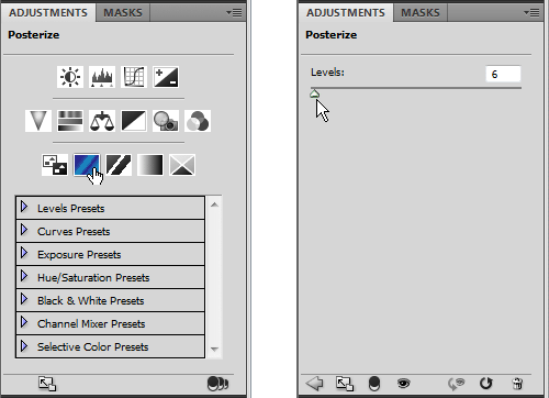
In the the adjustments panel, add a . Set the levels to about 6. This reduces the number of unique colours or shades of grey in the image to 6, giving the pattern a grainier appearance.
Go to the magic wand tool and click on the most predominant grey colour in the pattern layer. Leave all boxes in the options bar unchecked. You may have to to experiment with the tolerance to get a suitable pattern. I ended up using a tolerance of 60.
In the layers' palette, you can now hide or delete both the Pattern fill layer, and the Posterize adjustment layer. We only needed them to make this selection. After hiding those layers, the canvas will look something like this:
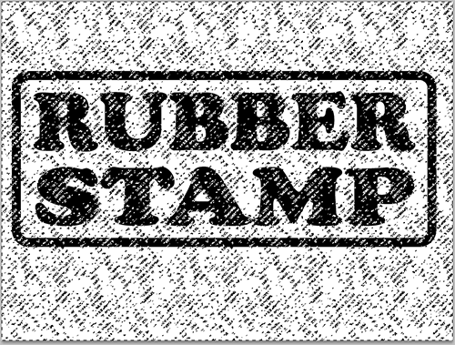
Now, make the layer with the Smart Object graphic the active layer, and add a layer mask. This mask will give the graphic the “grungy” look we're aiming for.
Add a colour overlay
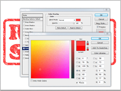
Black is not the colour we want to use for the final result. Adding a colour overlay fixes this. Right click on a blank area of the Smart Object layer, and select . Here is the settings used in this example.
Blend Mode: Normal
Opacity: 100%
Color: R 255 G 60 B 60 (faded red)
However, you may use other settings depending on how you plan to use the rubber stamp. For instance, as a background image for text, you probably want it in pale colour. If it is going to be used as a graphic on its own, a darker colour may be a better choice.
The pattern look quite realistic, but the edge lines are just too sharp for a rubber stamp. To soften it up you can apply an inner glow. In this example, I've used the following settings, but you can adjust to your liking. Just make sure the colour of the inner glow matches what will ultimately be your background colour. In this example, I've used white.
Blend Mode: Screen
Opacity: 50%
Noise: 50%
Technique: Softer
Source: Edge
Choke: 0%
Size: 3 px
I usually leave quality section with the default values.
If you toggle the check-box before saving, you can see this addition is subtle but effective.
Finishing touches
Rubber stamps are rarely applied in perfect alignment. To make it slightly askew use the rotate transformation () to rotate it.
Since a repeating pattern was used for the grunge mask, you may be able to spot a repeating pattern in the graphic. To disguise this effect, rotate the layer mask slightly.
- On the layer's palette, click the chain between the thumbnail for the stamp graphic and the layer mask to unlink the mask from the layer.
- Click on the layer mask thumbnail.
- Press
Ctrl-Tto enter free transform mode. - Rotate the mask slightly until the repeating pattern is less obvious.
Below is the resulting image:

Final word
[TBA]
Last update: 2012-11-28 [gh].