Bootstrap5
This chapter describes how to work with the Drupal Bootstrap5 theme. It also includes a step by description about how to create a subtheme.
Table of contents
- Introduction
- Installing
- Regions
- The GUI
- Create a subtheme
- Working with the subtheme
- Tweaks
- Final word
Drupal projects discussed in this chapter: Bootstrap5, Bootstrap 5 tools .
Introduction
Launched in late December 2020, this theme was a late entry into the race to bring Bootstrap to Drupal.
It is a non-prescriptive Bootstrap 5 theme with simple
configuration. It can be used out of the box or as a subtheme for
creating flexible web designs with minimal changes. (According to the
project's documentation, customization can be done by override
Bootstrap 5 in _variables_bootstrap.scss and recompile
SCSS.) It uses standard Bootstrap classes for “light” and “dark”
theme colours, and you can flip between them using the GUI. It
provides the skeleton SCSS necessary for local rebuilds of a custom
subtheme with sass.
It is from the same author as Bootstrap4, and the two are very similar, but Bootstrap5 is the version I recommend.
Some documentation is in the cocumentation wiki on Drupal.org (rather sparse at the moment). It also comes with a README.md. The Bootstrap 5 style guide is packaged with a companion module named Bootstrap 5 tools.
Installing
Bootstrap5 uses SASS (Syntactically Awesome Style Sheets) to generate CSS. If you don't have a SASS preprocessor installed, you need to install one first. Read this to learn how to install sass on Ubuntu.
To download the theme from Drupal.org, run the following in your siteroot:
$ composer reuire 'drupal/bootstrap5:^3.0'
This downloads the theme project and places it in
the themes/contrib folder.
Also (from README.md):
Install development dependencies by running npm install

To lint SASS files run npm run lint:sass (it will fail build if lint fails)
To lint JS files run npm run lint:js (it will fail build if lint fails)
To compile JS: run npm run build:js
Optional: Create symlink from bootstrap5 repo folder to a local Drupal installation to simplify development.
ln -s /path/to/bootstrap5 /path/to/local-drupal-site/web/themes/contrib
Regions
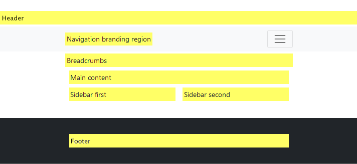
Nine regions are defined in bootstrap5.info.yml. These
are listed below, along with the initial placement of blocks within
them.
Some blocks contains special configuration elements. These are listed in parenthesises after the block name.
- Header
- —
- Navigation branding region
- Site branding (configure site branding)
- Main navigation region
- Main navigation (configure menu levels)
- Additional navigation region (eg search form, social icons, etc)
- User account menu (configure menu levels)
- Search form (configure search page)
- Breadcrumbs
- Breadcrumbs
- Main content
- Messages
- Page title
- Tabs (configure show tabs)
- Help
- Primary admin actions
- Main page content
- Sidebar first
- —
- Sidebar second
- —
- Footer
- Footer (configure menu levels)
- Powered by Drupal
The "demonstrate block regions" feature does not show all of the regions, and sidebars appear beside, not below the central column.

The GUI
The theme provides a GUI that let you configure a few options and create a custom subtheme. To access this, navifate to .
The following settings are identical to those listed under the “Global settings” tab, but can be overridden for the Bootstrap5 theme:
- Page element display
- User pictures in posts
- User pictures in comments
- User verification status in comments
- Shortcut icon
- Logo image
- Favicon
The following panels are specific to the theme:
- Style guide: Just a reference to the guide. There are no configuration settings.
- Body options: See notes below.
- Navbar options: See notes below.
- Footer options: See notes below.
- Subtheme: Generate a subtheme skeleton. Fill in the fields and press “Create”.
Under “Body options”, you may set the website container type to “fixed” or “fluid”. “Fixed” provides a fixed width layout on large viewports. “Fluid” will always fill the viewport. There is also a textfield with the heading “Website container type configuration” (have not experimented with it yet).
Out of the box, the width of the fixed main container with no sidebars are 1180 pixels, with 1160 remaining after gutters are removed.
For setting the text colour and background colour for these regions, please see section Colours below.
There are also some settings that can be set as part of block configuration.
Create a subtheme
A subtheme can be created from the GUI. Make sure the web server has write permission to the directory where the subtheme shall be created.
 The
built-in subtheme-generator makes sure everthing is named correctly,
and that the strings embedded in the subtheme files are the right
ones. Copying an existing subtheme and changing its name tend to
break. Always first create a subtheme, then change the SCSS to
match your requirements.
To compile sass, run from subtheme directory:
$ sass scss/style.scss css/style.css
$ sass scss/style.scss css/style.css --debug-info
The “debug-info”-option will insert a line that identify the source of each selector into the generated CSS.
Working with the subtheme
This section goes through various objectives (e.g. replacing the logo), and how to resolve them.
In the examples, the subtheme is assumed to be named "Mytheme".
Replacing the logo
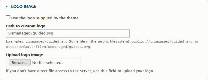
The logo file is named “logo.svg” and is copied from the base theme. You can overwrite it in the subtheme with your own logo.
If you instead want to upload, uploading an .svg logo through the subtheme's GUI
doesn't work (invalid file type). But placing it in or
below public:// works. The screenshot below shows a
logo with the path public://unmanaged/guided.svg being used instead of the default.

If the logo is not a scalable vector one, but a bitmap, the image should be scaled to the correct size and
its height should specifiesd in the file mytheme.scss:
.navbar-brand img {
  height: 40px;
}
Templates
The generated subtheme contains no templates. The base theme contains the following templates in seven groups:
- Block
block--system-branding-block.html.twigblock--system-menu-block.html.twig
- Content
off-canvas-page-wrapper.html.twigpage-title.html.twig
- Form
input.html.twigselect.html.twigtable.html.twig
- Layout
html.html.twigmaintenance-page.html.twigpage--styleguide.html.twigpage.html.twig
- Misc
status-messages.html.twig
- Navigation
breadcrumb.html.twigmenu--main.html.twigmenu-local-task.html.twigmenu-local-tasks.html.twigmenu.html.twigpager.html.twig
- Views
views-view-table.html.twig
Create the following groups in the subtheme and copy the templates indicated into it from the base theme (unless indicated otherwise):
- Layout
html.html.twignode.html.twig(from core)page.html.twig
- Misc
feed-icon.html.twig(from core)
You may also need this (reminder):
block--system-branding-block.html.twigimage.html.twigfile-link.html.twig
Responsive images
 Note
that the Bootstrap 3 class “
Note
that the Bootstrap 3 class “img-responsive” is gone. The replacement class for Bootstrap 4 and 5 is “img-fluid”. See
SO: No img-responsive in Bootstrap 4.
See also GBS: Images and Breakpoints.
Responsive videos
Use the following to embed responsive videos on a Bootstrap 5 based theme:
<div class="container text-center my-5 ratio ratio-16x9">
<iframe src="https://www.youtube.com/embed/1LjFCDHFJUY?rel=0" allowfullscreen></iframe>
</div>
Source Eamonn Cottrell: Responsive YouTube Embedding with Bootstrap.
Replace the "Access denied" message
The theme provides a block named "Messages" that by default is placed on top in the "Main content" region, as shown in the previous section.
When creating a premium website one may want to have a custom page
when "Access denied", explaining how to register to get premium access.
If this template exists: page--403.html.twig, it will be
used on all pages where access is denied.
If you want to set up the website so that instead of a just showing
the default "Access denied" page, you display a nicer message inviting
the visitor to register. You can do this by replacing the main
content with such a message in page--403.html.twig.
The default page.html.twig that comes with the
theme has this twig to show the main page content:
<div class="order-1 order-lg-2 {{ content_classes }}">
  {{ page.content }}
</div>
Copy this file to page--403.html.twig in your
subtheme, and replace the "page.content" variable with some
alternative text. Example:
<div class="order-1 order-lg-2 {{ content_classes }}">
  <p>To see the content we offer, please register.</p>
</div>

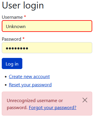
However, if the "Message" block is placed in "Main content", error, and other messages, will no longer appear on the screen. For example, if the user tries to log on, and fails, the "Unrecognized username or password." error message will no longer appear. This may result in the user trying to log on not understanding what the problem is.
The remedy is to move the "Messages" block to some other region, that is still shown, for example to "Sidebar first".
How the "Messages" block appears after a login failure when placed at the bottom of "Sidebar first" is shown in the screenshot on the left".
SASS
The distribition comes with a copy of Bootstrap 5
(ver. 5.3.2). It lives in the
directory /dist/bootstrap/5.3.2/ and must not be altered
(but can be updated to a newer version of Bootstrap 5 when one exists. Refer
to scss/_variables_bootstrap.scss to look up Bootstrap the variables
overridden by the base theme.
For reference, here is a list of files that exist in the base theme:
style.scss_bootstrap_fix.scssBootstrap fixes_bootstrap_variables.scssOverride a few Bootstrap colours for compatibility._mixins.scss@mixin b4-make-link_theme.scss@import all drupal classes_theme_variables.scssTheme variables.drupal/_buttons.scss_footer.scss_forms.scss_layout.scss_local_tasks.scss_misc.scss_navbar.scss_paragraphs.scss
Colours
The “Body options” “Navbar options” and “Footer options” share pulldown menus for “theme” and “background”.
The theme options sets the text colour (background must be set separately) provides the following alternatives:
- do not apply theme
- light (dark text/links against a light background)
- dark (light/white text/links against a dark background)
For the background there are two more options:
- do not apply colour
- primary
- secondary
- light
- dark
These represents a subset of the Bootstrap standard classes for background.
To create a theme with a light body, and dark header and footer, select:
- Body options: Theme/background – do not apply.
- Navbar options: Theme/background – dark.
- Footer options: Theme/background – dark.
 While
not coordinated (so selecting the “dark” theme option along with the
“light” background option will produce light/white text on a light
background, which is unreadable), you need to keep the settings in
sync. Also: If "light" is selected for the body, the theme colour
is applied, which means that the text color becomes
the
 $dark colour used for the navbar and footer. By
selecting "do not apply" we get the the Bootstrap 5 defaults, which
usually is a better fit.
The base theme by default constructs a navbar with these standard Bootstrap classes. You'll get the first one if you select the “light” navbar theme, and the second one if you select the “dark” navbar theme.
<nav class="navbar navbar-expand-lg navbar-light text-dark bg-light">
<nav class="navbar navbar-expand-lg navbar-dark text-light bg-dark">
To override the default Bootstrap colours, set the
variables $light and $dark
in _variables_bootstrap.scss in the
subtheme. Example:
$light: #ffff00; // yellow
$dark:  #ff0000; // red
This will change the "light" colour from #f8f9fa
(almost white) to yellow, and the "dark" colour
from #212529 (almost black) to red, which better
demonstrates the scope of these settings than the defaults.
The dark option initally applied the following filter (defined in scss/drupal/_navbar.scss) to invert the icon:
img {
  filter: invert(1);
}
The filter was removed in January 2022, in this update – but this change is not mentioned in the release notes.
The default uses a very small font with s semi-transparent overlay for the main menu and user menu. To change, put the following in the sub-theme's SCSS:
// Use a larger, bold, font for the navbar menus
.navbar-nav {
  color: white;
  font-weight: $font-weight-bold;
  font-size: $h3-font-size;
}
// Remove the semi-transparent overlay.
.navbar-dark .navbar-nav .nav-link {
    color: white;
}
Sources:
- GeeksforGeeks: How to change navigation bar color in bootstrap
- SO: Change navbar color in twitter bootstrap
// scss-docs-start color-variables
$blue:     #0d6efd !default;
$indigo:   #6610f2 !default;
$purple:   #6f42c1 !default;
$pink:     #d63384 !default;
$red:      #dc3545 !default;
$orange:   #fd7e14 !default;
$yellow:   #ffc107 !default;
$green:    #198754 !default;
$teal:     #20c997 !default;
$cyan:     #0dcaf0 !default;
$dawnpink: #ede9e3;
Fonts
See also GBS: Typography.
font-family-sans-serif:      system-ui, -apple-system, "Segoe UI", Roboto,
  "Helvetica Neue", Arial, "Noto Sans", "Liberation Sans", sans-serif,
  "Apple Color Emoji", "Segoe UI Emoji", "Segoe UI Symbol",
  "Noto Color Emoji" !default;

$font-family-monospace:       SFMono-Regular, Menlo, Monaco, Consolas,
  "Liberation Mono", "Courier New", monospace !default;

$font-family-base:            var(--#{$variable-prefix}font-sans-serif) !default;
$font-family-code:            var(--#{$variable-prefix}font-monospace) !default;

// $font-size-root effects the value of `rem`, which is used for as well font sizes,
// paddings and margins
// $font-size-base effects the font size of the body text
$font-size-root:              null !default;
$font-size-base:              1rem !default; // Assumes the browser default, e.g. 16px
$font-size-sm:                $font-size-base * .875 !default;
$font-size-lg:                $font-size-base * 1.25 !default;
Site name
To make the site name appear in mixed case, and larger, in _variables_drupal.scss, change these lines:
$navbar-brand-site-title-text-transform: uppercase !default;
$navbar-brand-site-title-font-size: 1.5rem !default;
to:
$navbar-brand-site-title-text-transform: none;
$navbar-brand-site-title-font-size:2.0rem;
To get the site slogan to appear, navigate to , and press "Configure" for the "Site branding" block.
Common tweaks
This is just a list of tweaks I do to a new website after setting up a site with a Bootstrap5 subtheme, to remind myself about how to do it.
Remove the RSS icon
To remove the link to the RSS feed, do the following in your
subtheme, in the directory templates/misc/:
$ touch feed-icon.html.twig
$ drush cr
To work with the feed-icon templates, these ship with core:
# Drupal 9:
core/themes/stable/templates/misc/feed-icon.html.twig
core/themes/olivero/templates/misc/feed-icon.html.twig
# Drupal 10:
core/themes/stable9/templates/media-library/feed-icon.html.twig
core/themes/olivero/templates/misc/feed-icon.html.twig
Show ISO date in bylines
Change the default medium date.
Search block
The search block is by default placed in the "Additional navigation
region". In page.html.twig, it looks like this:
<div class="collapse navbar-collapse justify-content-md-end" id="navbarSupportedContent">
  {{ page.nav_main }}
  {{ page.nav_additional }}
</div>
This will make the search block appear after the main navigation menu.
In order to put it above the menu, use the following twig:
<div class="collapse navbar-collapse justify-content-md-end" id="navbarSupportedContent">
  <div class="clearfix">
    <div style="display: flex; justify-content: flex-end">
      {{ page.nav_additional }}
    </div>
    {{ page.nav_main }}
  </div>
</div>
To alter the Search form input field with:
.form-search {
  width:30rem;
}
Final word
[TBA]
Last update: 2022-01-05 [gh].